The data triangle in the AMiDA project
We are about to finalize an ESA project called AMiDA, and thus I think it is a good moment to recapitulate and look back at what things we have achieved and explored technology-wise during this project. Just a very quick introduction, the project was lead by SISTEMA (opens new window) and participating in the activity was ZAMG (opens new window), cloudflight (opens new window), as well as us (EOX).
The scope of the project was to provide entities active in the atmospheric domain in Austria a platform to handle day-to-day work in an efficient way. Five use cases were conducted where, apart from cloudflight and ZAMG, LuftBlick OG (opens new window) and the Solar Radiation and Air Quality group (Institute for Biomedical Physics (opens new window) - Medical University of Innsbruck) participated.
Our part in this project was the web browser data visualization module (called DAVE). There are many very interesting aspects to this project, related for example to processing. However, I will be focusing on technologies we used and applied.
# Data visualization on a web client
When developing the visualization component running in a web browser a great deal of consideration has to be taken to decide where the actual rendering should take place. It is not easy to find the best balance: You can do your rendering (image/raster creation) on the server or (thanks to modern browsers) directly on the web browser. Each approach has its pros and cons.
In AMiDA we focused on the "data triangle", i.e. data coming from ground stations, satellite data and model data. The processing aspect previously mentioned had the main task of facilitating comparison and correlation of these datasets (but more on that maybe for another time).
As for the web client visualization we decided it would be a good approach to do the rendering completely on the client (web browser). This allowed us to use multiple tools in the client to access and manipulate the data from these three different sources. Having the actual values on the client allows quick manipulation of the data, its visualization as well as comparison of actual values through picking, for any location loaded. This provides very quick interactivity once the data is loaded, but also means longer loading times and high load on the resources of the user's machine.
# Tools used
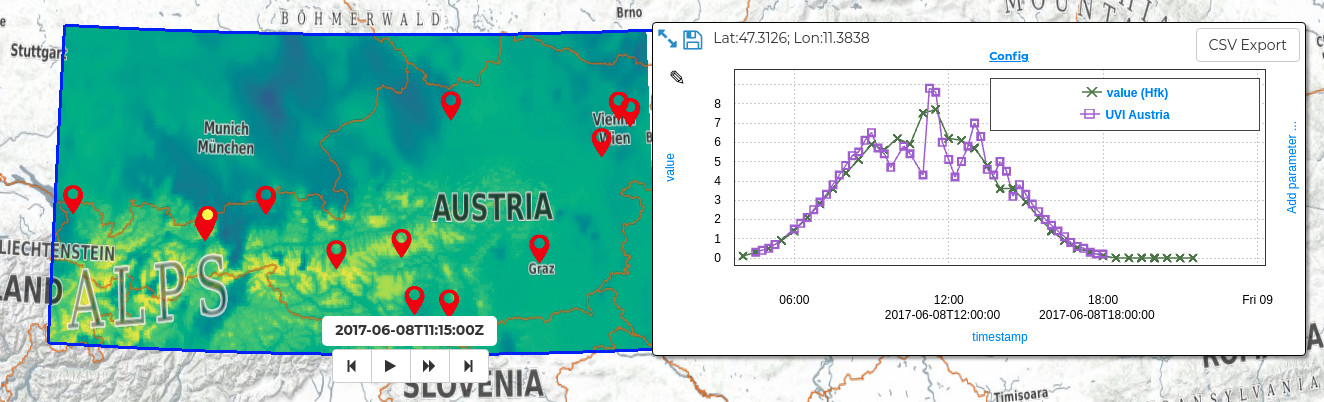
To load raster data to the client we used a Web Coverage Service (WCS) (opens new window) interface. This allowed to retrieve GeoTIFFs for the relevant areas and time selected by the user. We can then read the data with help of geotiff.js (opens new window) and render it using plotty.js (opens new window). We already presented these tools a while back in the Visualizing Raster Data (opens new window) blog post. It is great that we were able to incorporate these two tools in new projects allowing us to keep evolving and improving them through time.
Additional to both these tools we also integrated graphly (opens new window) to allow quick and efficient plotting of data points pierced through the time stacks of data as well as ground station measurements. Although there is a really large selection of good plotting tools, it was quite difficult to find one that really fit our needs. In other services such as VirES for Swarm (opens new window) or VirES for Aeolus (opens new window) we needed very good performance to render multiple thousands of points, as well as interactivity, and configurability. Some solutions fit in some aspects, but changing the aspects that do not fit imposed quite a big challenge, which would mean possibly changing core concepts of the selected tool.
Thus graphly was born, initially as a high performing plotting tool for scatter plots where the rendering is done in WebGL. With the help of logic built into the pixel shader it has evolved into a more capable configurable plotting tool. This allows for—among other things—multiple stacked synchronized plots which are highly customizable.
In the animation above you can see a comparison between Sentinel 5P NO2 total column data and NO2 total column measurements from a ground-based Pandora station. The DAVE platform implements also a modifier expression field which allows application of basic arithmetic functions on the retrieved data. In the example shown this is important because the sources use different units of measurement. Having the data on the client allows quick manipulation through the function to convert the unit of measurement into a comparable unit.
# Lessons learned
We learned from user feedback that the functionality provided by the DAVE component is very much appreciated and overall described as an ideal tool to explore and browse the data to find interesting atmospheric events. Through the possibility of animations of the models and picking through time also the temporal evolution can be explored very intuitively.
The downside is that some users experienced the loading time for larger time periods to be too long, as well as some crashes due to loading large amounts of data. It is very difficult to implement safeguards to limit the access to data to fit the available resources on the user's machine. This is because from within the web browser you can't really find out, for example, available RAM in the system.
Reviewing the different approaches users take to look at the data we think a possible middle ground solution is to better manage different "levels of detail" for the data. It would be possible to dynamically change the detail requested for the data depending on how much data is requested, i.e. how large the area of interest is as well as the time period of interest. Still this would need to be communicated to the user in an easy-to-understand way.
All in all we are very happy with the results and hope we will be able to further integrate our experiences and evolve our technologies in future endeavors.