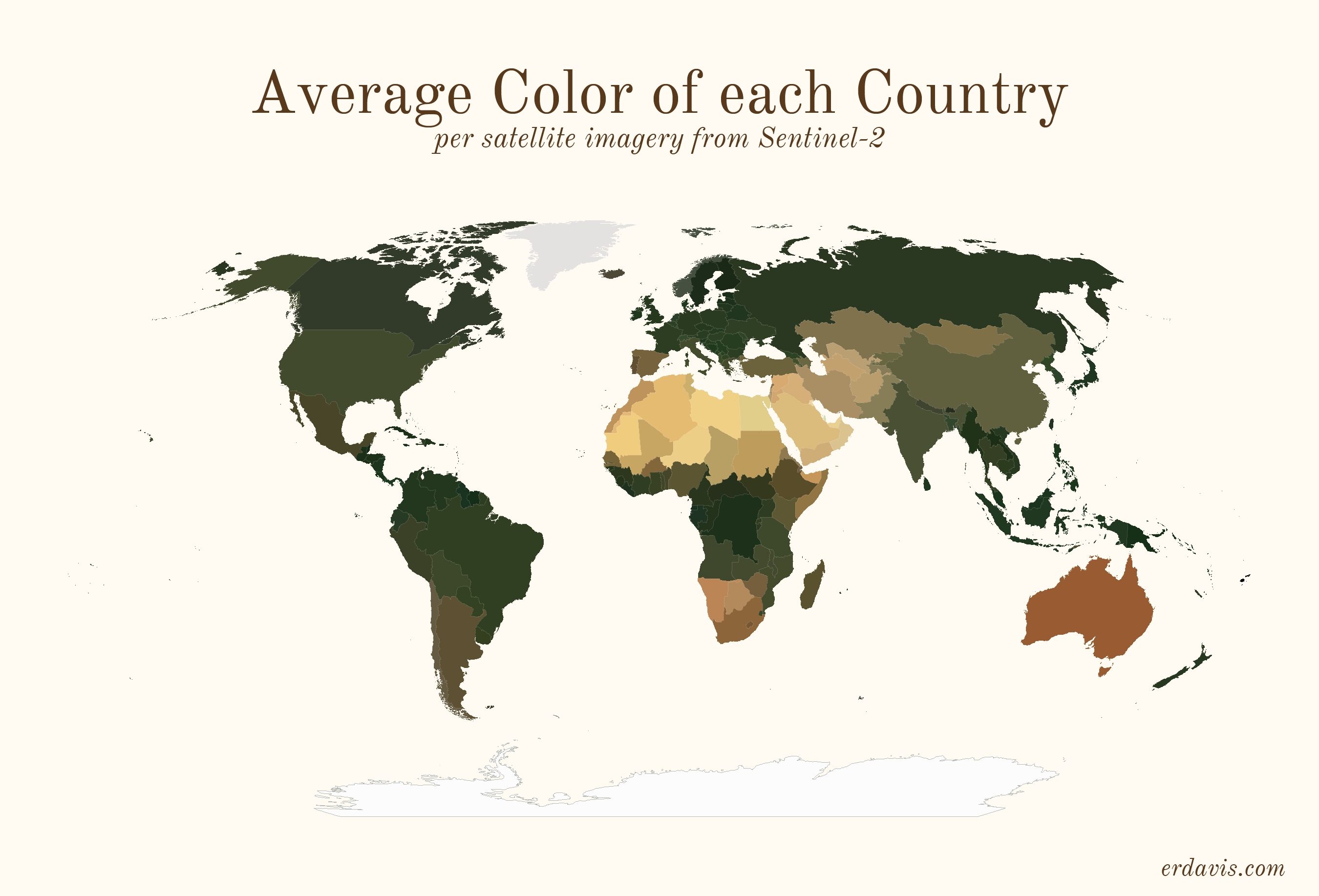
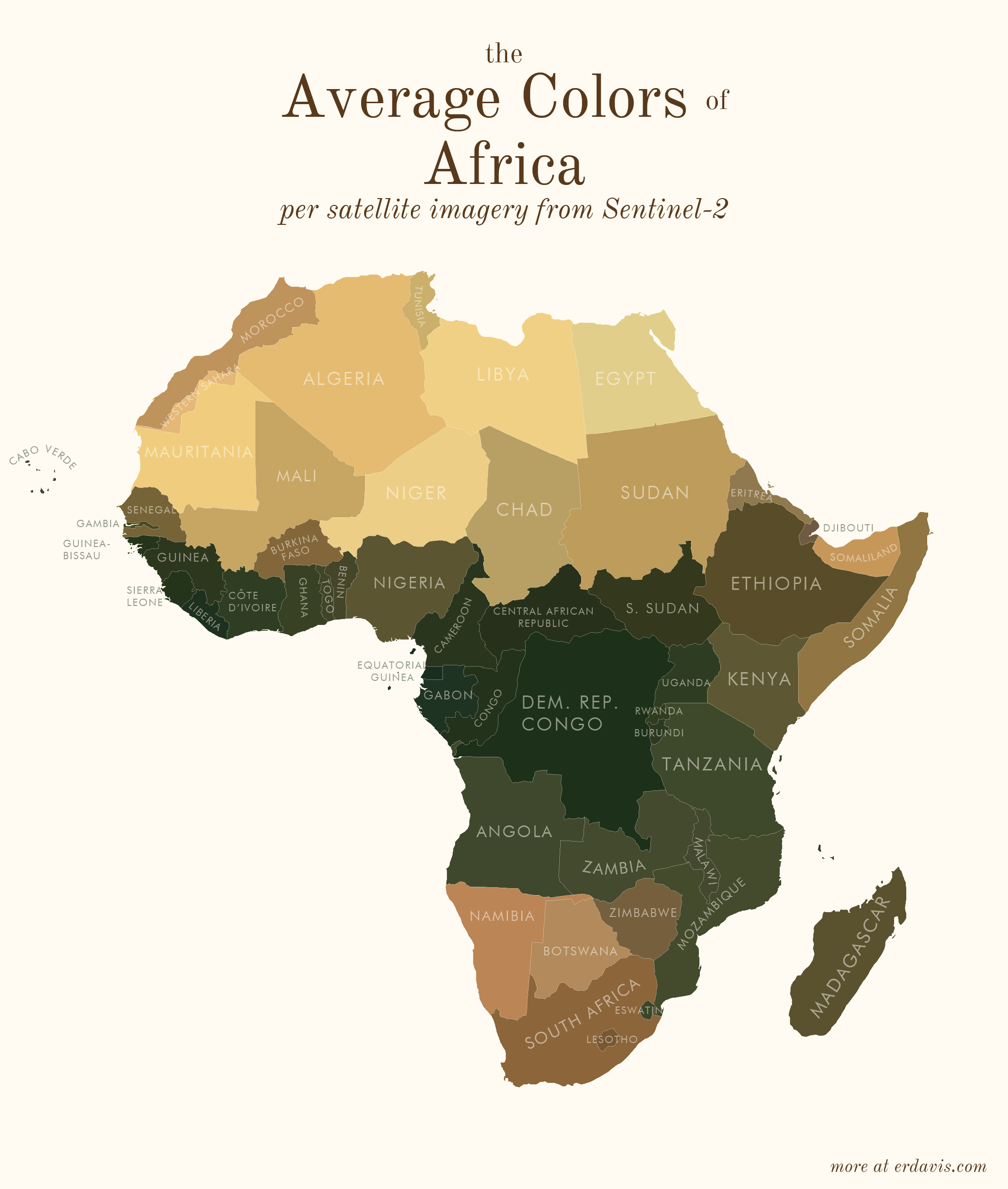
Average colors of the world
Couple of weeks ago we have noticed the article (opens new window) getting attention around twitter (opens new window). As it is using our WMS (opens new window) EOxMaps endpoint we have asked Erin Davis (opens new window) if we could host her idea here. At EOX we endorse brilliant and unique ideas that utilize our tools and data. Thank you for this most interesting contribution. Now follows the original article.
I wrote that I wanted to expand creatively beyond maps in 2021, but here we are, halfway in, and half my posts are maps.
In my defense, I made these last year and just haven’t gotten around to posting them yet! They’ve been sitting in a folder since December, mocking me. It’s time to get these guys off my computer and out into the world so I can move on to other things.
Since it’s been so long, I really don’t remember what inspired me to make these. I’m sure memories of this amazing NYT Upshot article (opens new window) were involved. The difference here is I didn’t even try to tell a story with these maps… I just made them as something pretty to look at.
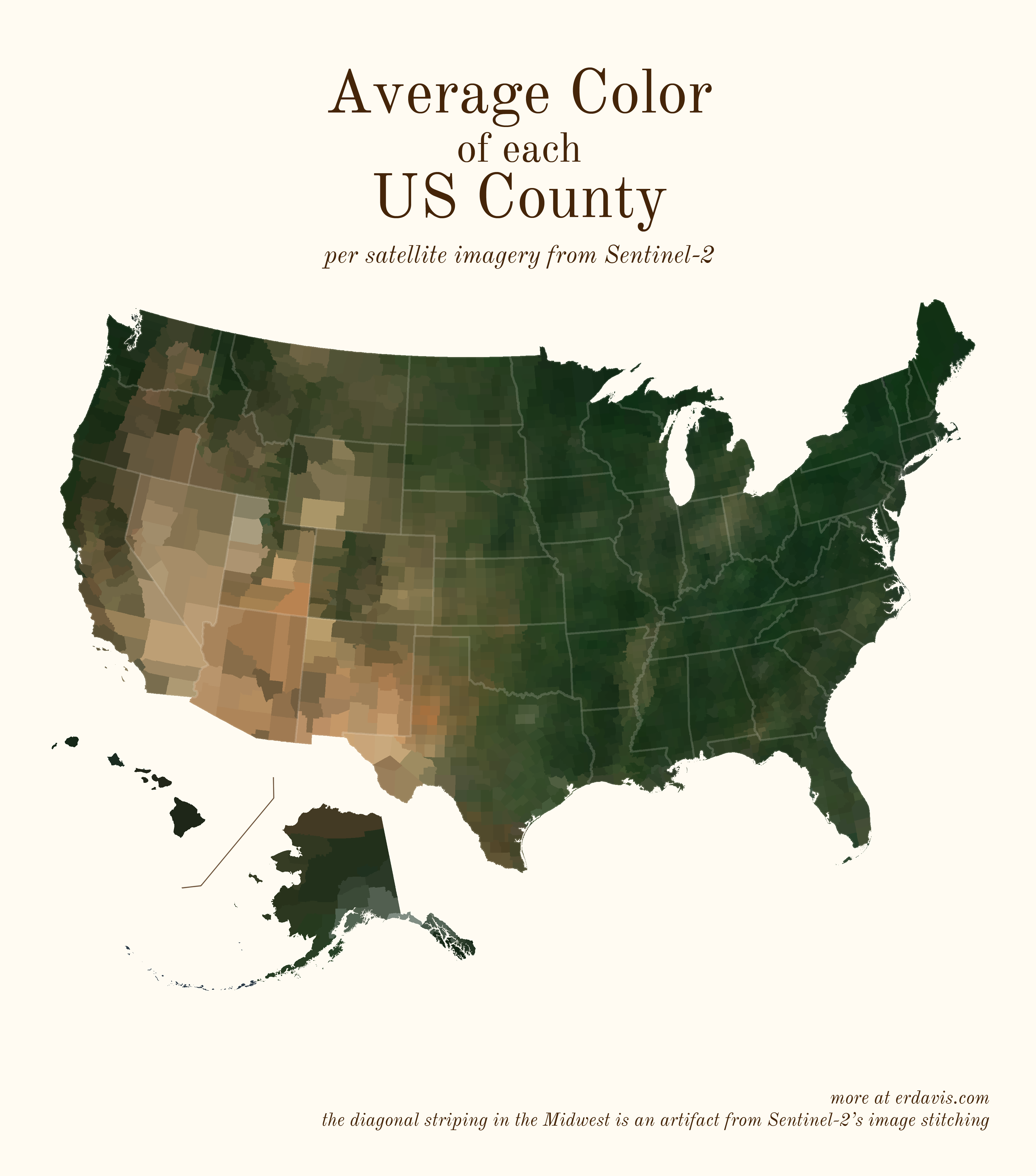
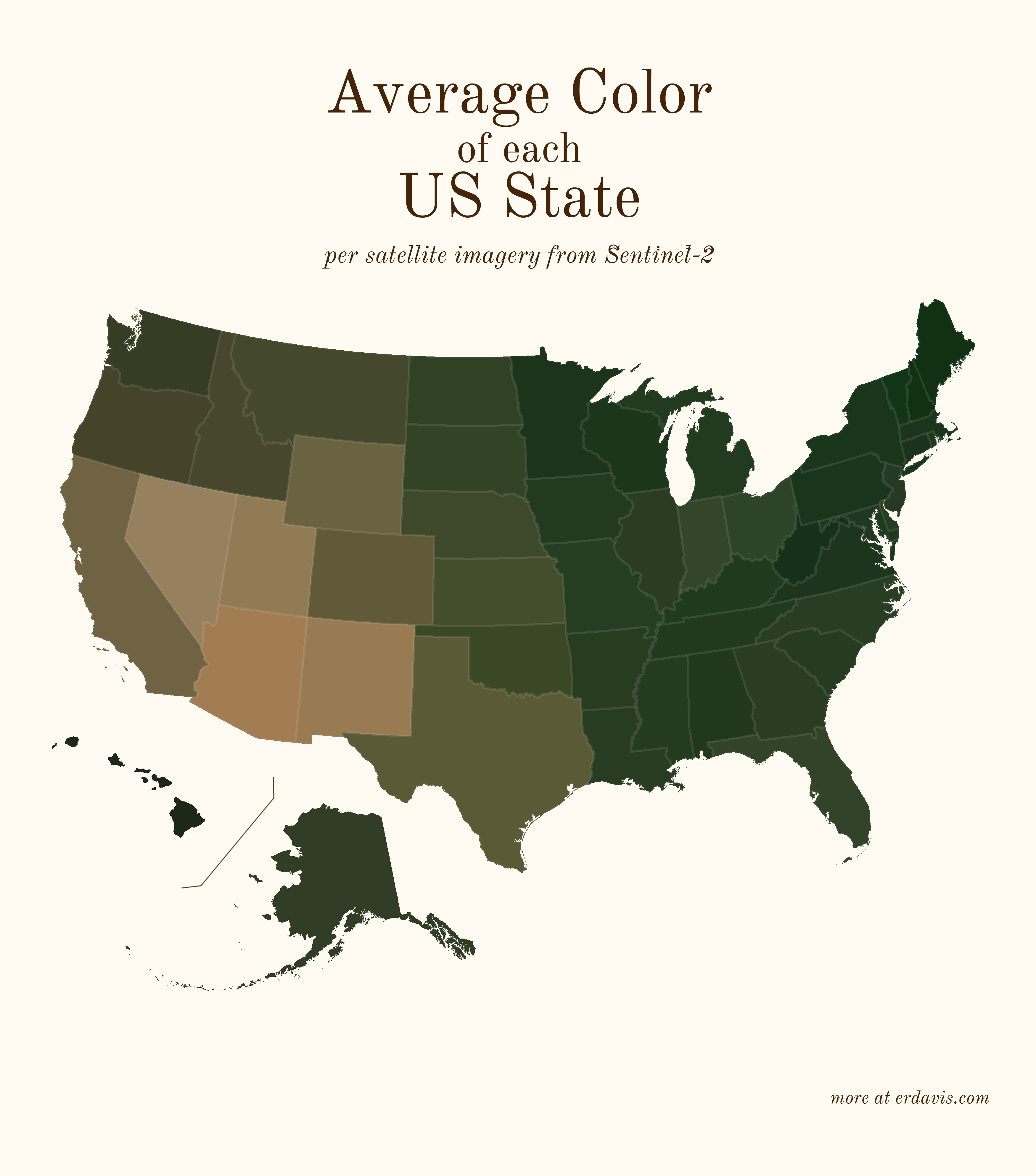
# Average colors of the USA
A question: do you think it’s best practice to label US states? I usually haven’t in my personal work, but I do in my day job… the labeled look might be growing on me.
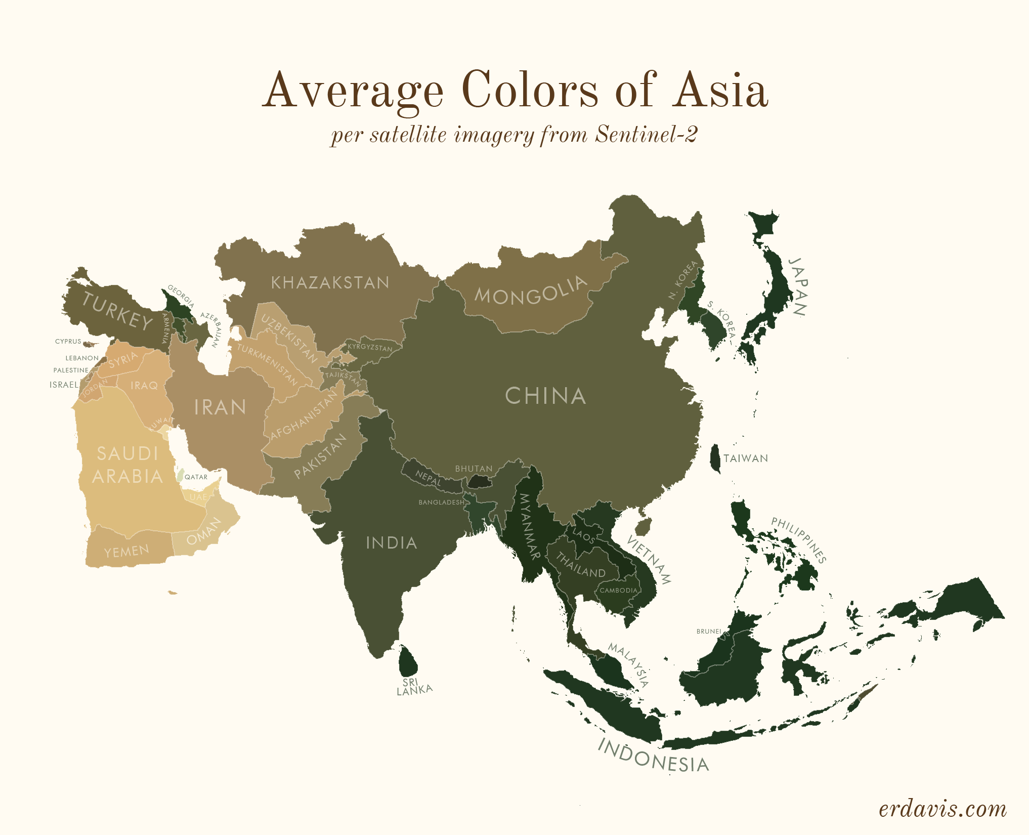
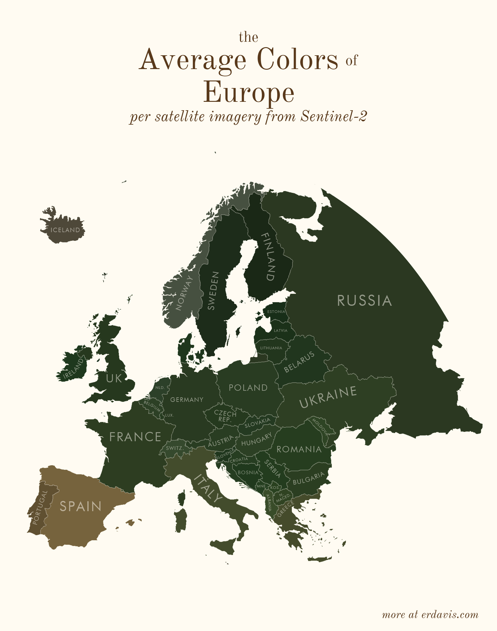
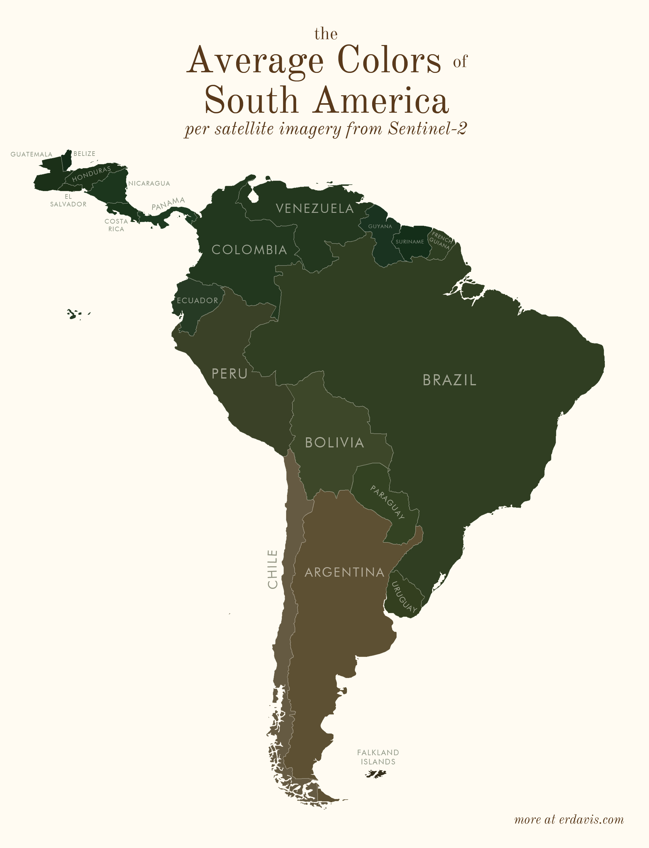
# Average colors of the world
# How I did it
To do this, you’ll need a few things:
- A shapefile of the areas you want the colors for (from e. g.: https://www.naturalearthdata.com/ (opens new window))
- QGIS (opens new window) installed (or GDAL/Python, but installing QGIS will set it all up for you)
- R and RStudio (opens new window) installed
In short, my process was the following:
- Wrote a script (in R) to find the bounding boxes of all the areas I was interested in
- In R, downloaded pictures of those areas from Sentinel-2
- In R, wrote a script that created a series of GDAL (opens new window) commands to:
- Georeference the downloaded image to create a geotiff
- Crop the geotiff to the borders of the area
- Re-project the geotiff to a sensible projection
- Ran that GDAL script
- In R, converted the geotiffs back to pngs, and found the average color of the png
Basically, I did everything in R, including creating the GDAL script. I just briefly stepped outside of R to run that script then jumped back in to finish the project. What the GDAL script does is possible within R using the qgisprocess (opens new window) package, but I’m pretty sure (based on 0 testing tbh) that GDAL is faster.
Side note: I feel really embarrassed lifting the curtain and showing my wacky processes to get viz done. I’ve often avoided sharing, especially in professional situations, for fear that better-informed people will laugh at me. But I think it’s good to have more people sharing their code so we can all improve. All my GIS knowledge (and quite a lot of my general coding knowledge) is self-taught, and I owe a huge debt to people online who bothered to explain how they did things. My point? I don’t know… I guess if you know of a better way to do this, please let me know! But also I was really proud I figured out this much on my own.
# install the necessary packages. only need to run this once
# install.packages(c('sf', 'magick', 'dplyr'))

# load in the packages. you need to do this every time you open a fresh R session
library(magick)
library(sf)
library(dplyr)
2
3
4
5
6
7
Get your shapefile loaded and prepped:
# set your working directory, the folder where all your files will live
setwd("C:/Users/Erin/Documents/DataViz/AvgColor/Temp/")

# create the subfolders that you'll need
dir.create(file.path(getwd(), "satellite"), showWarnings = FALSE)
dir.create(file.path(getwd(), "shapes"), showWarnings = FALSE)

# load in your shapefile. I'm using the US states one from here:
# https://www.census.gov/geographies/mapping-files/time-series/geo/carto-boundary-file.html
shapes <- read_sf("cb_2018_us_state_20m.shp")

# we need to separate out the shapefile into individual files, one per shape
for (i in 1:nrow(shapes)) {
  shape <- shapes[i, ]
  write_sf(shape, paste0("./shapes/", shape$NAME, ".shp"), delete_datasource = TRUE)
}
2
3
4
5
6
7
8
9
10
11
12
13
14
15
16
Download the satellite imagery
# load in your shapefile. I'm using the US states one from here:
# https://www.census.gov/geographies/mapping-files/time-series/geo/carto-boundary-file.html
shapes <- read_sf("cb_2018_us_state_20m.shp")

# for each shape in the shapefile, download the covering satellite imagery
for (i in 1:nrow(shapes)) {
  shape <- shapes[i, ] %>% st_transform(4326)
  box <- st_bbox(shape)

  url <- paste0("https://tiles.maps.eox.at/wms?service=wms&request=getmap&version=1.1.1&layers=s2cloudless-2019&",
                "bbox=", box$xmin-.05, ",", box$ymin-.05, ",", box$xmax+.05, ",", box$ymax+.05,
                "&width=4096&height=4096&srs=epsg:4326")

  # note: this assumes your shapefile has a column called NAME. you'll need to change this to a
  # different col if it doesn't
  download.file(url, paste0("./satellite/", gsub("/", "", shape$NAME), ".jpg"), mode = "wb")
}
2
3
4
5
6
7
8
9
10
11
12
13
14
15
16
17
Create a GDAL script to transform those square satellite images into cropped, reprojected geotifs.
Note: for some reason, GDAL refuses to deal with any folders other than my temp directory. I couldn’t figure out how to get it to successfully write to my working directory, so I just did stuff in the temp one. Minor annoyance, but what can you do.
# time to create the GDAL script
if (file.exists("script.txt")) { file.remove("script.txt")}

# first, georeference the images - convert them from flat jpgs to tifs that know where on the globe the image is
for (i in 1:nrow(shapes)) {
  shape <- shapes[i, ]
  box <- st_bbox(shape)

  file_origin <- paste0(getwd(), '/satellite/', shape$NAME, '.jpg')
  file_temp <- paste0(tempdir(), "/", shape$NAME, '.jpg')
  file_final <- paste0(tempdir(), "/", shape$NAME, '_ref.tif')

  cmd1 <- paste0("gdal_translate -of GTiff",
                 " -gcp ", 0, " ", 0, " ", box$xmin, " ", box$ymax,
                 " -gcp ", 4096, " ", 0, " ", box$xmax, " ", box$ymax,
                 " -gcp ", 0, " ", 4096, " ", box$xmin, " ", box$ymin,
                 " -gcp ", 4096, " ", 4096, " ", box$xmax, " ", box$ymin,
                 ' "', file_origin, '"',
                 ' "', file_temp, '"')

  cmd2 <- paste0("gdalwarp -r near -tps -co COMPRESS=NONE  -t_srs EPSG:4326",
                 ' "', file_temp, '"',
                 ' "', file_final, '"')

  write(cmd1,file="script.txt",append=TRUE)
  write(cmd2,file="script.txt",append=TRUE)
}

# next, crop the georeferenced tifs to the outlines in the individual shapefiles
for (i in  1:nrow(shapes)) {
  shape <- shapes[i, ]
  file_shp <- paste0(getwd(), '/shapes/', shape$NAME, '.shp')
  file_orig <-  paste0(tempdir(), "/", shape$NAME, '_ref.tif')
  file_crop <-  paste0(tempdir(), "/", shape$NAME, '_crop.tif')

  cmd <- paste0("gdalwarp -cutline",
                ' "', file_shp, '"',
                " -crop_to_cutline -of GTiff  -dstnodata 255",
                ' "', file_orig, '"',
                ' "', file_crop, '"',
                " -co COMPRESS=LZW -co TILED=YES --config GDAL_CACHEMAX 2048 -multi")

  write(cmd,file="script.txt",append=TRUE)
}

# reproject the shapes to a reasonable projection, so they're not as warped and stretched
for (i in  1:nrow(shapes)) {
  shape <- shapes[i, ]

  center <- st_centroid(shape) %>% st_coordinates
  utm <- as.character(floor((center[1] + 180) / 6) + 1)
  if (nchar(utm) == 1) {utm <- paste0("0", utm)}
  if (center[2] >=0) {
    epsg <- paste0("326", utm)
  } else {
    epsg <- paste0("327", utm)
  }

  file_orig <- paste0(tempdir(), "/", shape$NAME, '_crop.tif')
  file_mod <- paste0(tempdir(), "/", shape$NAME, '_reproj.tif')

  cmd <- paste0("gdalwarp -t_srs EPSG:", epsg,
                ' "', file_orig, '"',
                ' "', file_mod, '"')

  write(cmd,file="script.txt",append=TRUE)
}
2
3
4
5
6
7
8
9
10
11
12
13
14
15
16
17
18
19
20
21
22
23
24
25
26
27
28
29
30
31
32
33
34
35
36
37
38
39
40
41
42
43
44
45
46
47
48
49
50
51
52
53
54
55
56
57
58
59
60
61
62
63
64
65
66
67
Now’s the time to step out of R and into GDAL
- In the start menu, search for OSGeo4W Shell and open it. You should see a command-line style interface.
- In your working directory, find and open script.txt. It should have a bunch of commands in it.
- Copy all the commands in script.txt and paste them right into the OSGeo4W Shell. Press enter to run the commands.
- If you have many shapefiles, this might take a while. Wait until everything has finished running before moving to the next step.
Now, hop back into R.
Move the files we just created back into the working directory.
# move the files from temp back to the wd
files <- list.files(tempdir(), pattern = "_reproj.tif")
for (i in 1:length(files)) {
  file.rename(from=paste0(tempdir(), "/", files[i]),to= paste0("./reproj/", files[i]))
}
2
3
4
5
Now get the average color of each image. Here I use a slightly different method than I did for the plots shown above. While writing up this code, I found a neat trick (resizing the image down to 1 px) that works faster than what I did before (averaging the R, G, and B values of each pixel).
# get the average color of each file
files <- list.files("./reproj/")
colors <- NULL

for (i in 1:length(files)) {
  # remove the white background of the image
  img <- image_read(paste0("./reproj/", files[i]))
  img <- image_transparent(img, "#ffffff", fuzz = 0)

  # convert to a 1x1 pixel as a trick to finding the avg color. ImageMagick will average the
  # colors out to just 1.
  img <- image_scale(img,"1x1!")

  # get the color of the pixel
  avgcolor <- image_data(img, channels = "rgba")[1:3] %>% paste0(collapse="")

  # save it in a running list
  colors <- bind_rows(colors, data.frame(name = gsub("_reproj.tif", "", files[i]), color = paste0("#", avgcolor)))
}

# save the color file if you need it later
write.csv(colors, "colors.csv", row.names = F)
2
3
4
5
6
7
8
9
10
11
12
13
14
15
16
17
18
19
20
21
22
Et voilà! A lovely csv with the average color of each of your regions.
And if you’d like to plot it all pretty, here’s how I did it in R. For this example, I’m only going to plot the lower 48 states.
# install the necessary packages. only need to run this once
install.packages(c('sf', 'ggplot2', 'ggthemes', 'dplyr'))

# load in the packages. you need to do this every time you open a fresh R session
library(sf)
library(ggplot2)
library(ggthemes)
library(dplyr)

# set your working directory
setwd("C:/Users/Erin/Documents/DataViz/AvgColor/Temp/")

# load the data
shapes <- read_sf("cb_2018_us_state_20m.shp")
colors <- read.csv("colors.csv")

# you'll need to change the join column names here if they're different than mine
shapes <- inner_join(shapes, colors, by = c("NAME" = "name"))

# transform the shapefile to a reasonable projection
# if you're unsure here, google "epsg code" + "your region name" to find a good code to use
shapes <- st_transform(shapes, 2163)

# for example purposes only, I'm removing Alaska, Hawaii, and PR
shapes <- subset(shapes, !(STUSPS %in% c("AK", "HI", "PR")))

# plot it
ggplot() + theme_map() +
  geom_sf(data = shapes, aes(fill = I(color)), color = alpha("#fffbf2", .1)) +
  theme(plot.background = element_rect(fill = '#fffbf2', colour = '#fffbf2'))

# save it
ggsave("avgcolors.png", width = 7, height = 9, units = "in", dpi = 500)
2
3
4
5
6
7
8
9
10
11
12
13
14
15
16
17
18
19
20
21
22
23
24
25
26
27
28
29
30
31
32
33
Erin Davis
Originally posted on the 26th of June 2021 at https://erdavis.com/ (opens new window)
Link to the article: https://erdavis.com/2021/06/26/average-colors-of-the-world/ (opens new window)
Sentinel-2 cloudless - https://s2maps.eu (opens new window) by EOX IT Services GmbH (Contains modified Copernicus Sentinel data 2019)
Media coverage and other references:
- https://mymodernmet.com/erin-davis-maps-average-colors-of-the-world/ (opens new window)
- https://www.zmescience.com/science/news-science/average-colors-of-world-map-052353/ (opens new window)
- https://flowingdata.com/2021/06/29/average-color-of-geographic-areas/ (opens new window)
- http://googlemapsmania.blogspot.com/2021/06/the-average-color-of-earth.html (opens new window)
- https://blog.adafruit.com/2021/07/17/data-scientist-makes-maps-of-the-average-colors-of-the-world/ (opens new window)