VirES - Swarm and magnetic model data visualization
As briefly anticipated by Stephan in Top 5 trends in EO data usage I'm happy to give an extended sneak preview on the prototype implementations we have done as part of the VirES project. Especially now that it has been decided to be extended for operations as an official service of the European Space Agency (ESA) for early 2016 where it will be openly accessible.
# About the project
The VirES project, short for Virtual Workspaces for EO Scientists, is an ESA Technology Research Project (TRP) (opens new window). The first phase started with collecting and analyzing user requirements from a variety of science communities for a generic "workspace" tool that could handle multiple missions, with emphasis on ESA's Earth Explorers missions (opens new window). For the second phase we implemented a prototype specifically for the Swarm (opens new window) mission but still based on the generic requirements collected. The implementation phase has been finalized and presented on various occasions such as at the IUGG at Prague (opens new window) and the Swarm 5th Data Quality Workshop at IPGP (Paris) with great feedback so far.
# The prototype
This is a very extensive subject from which I am going to cherry pick some visual examples in a second, but I just want to mention the rough architecture first. We make use of EOxServer (opens new window) for servicing the registered L1B Swarm Data (opens new window). It is not necessary to duplicate the data in any way, the EOxServer registers a reference to the CDF file and the data served through the interfaces is directly accessed. As interfaces we use OGC Web Services (opens new window), such as WMS (opens new window) or WCS (opens new window), where appropriate. For specialized cases we use WPS (opens new window) which allows us to do some processing (like calculating residuals, on which I will comment in a bit). The client runs directly in the browser without need of installation of any kind of plugin making use of WebGL and SVG (Scalable Vector Graphics) for visualization.
# Components
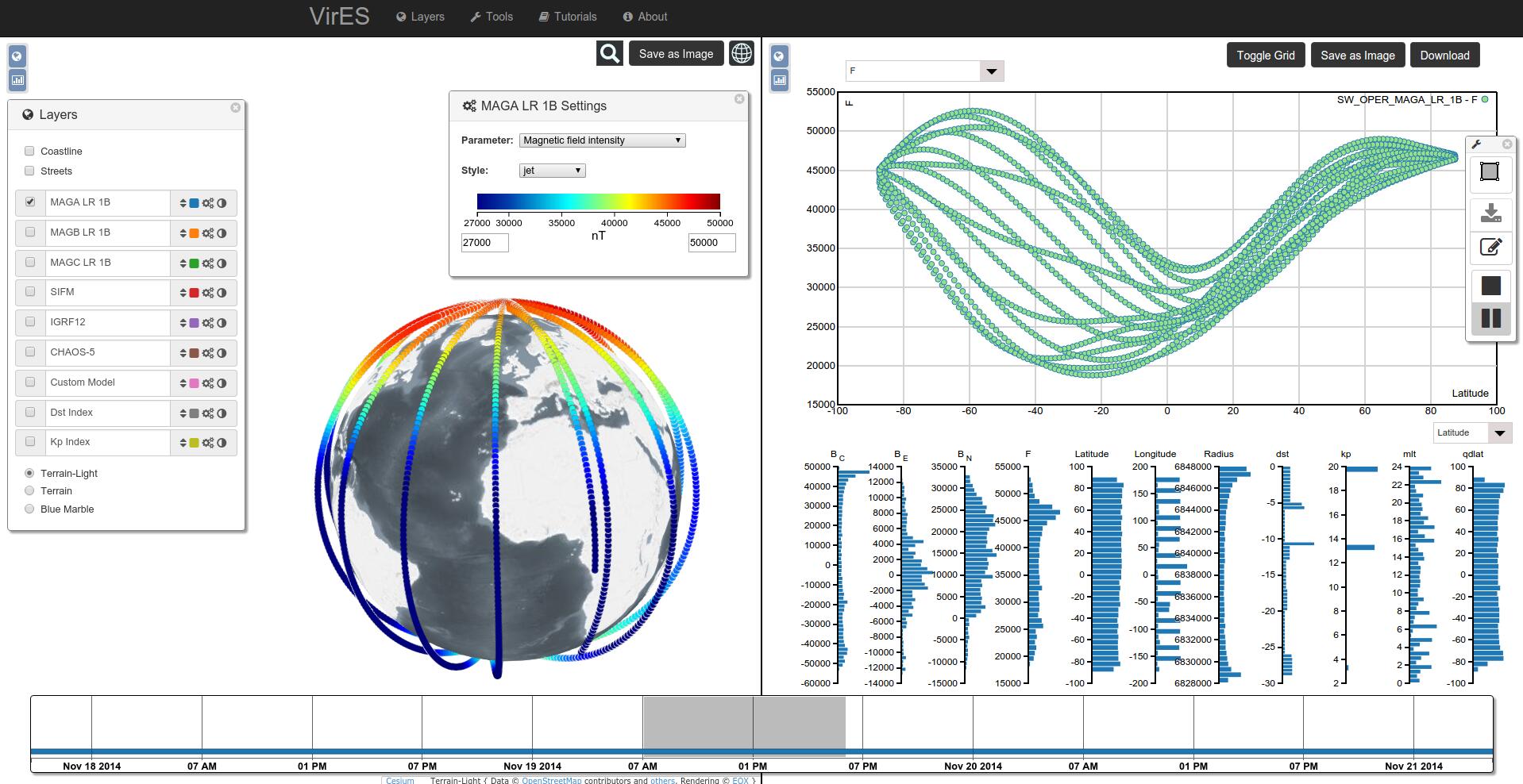
Here is a screenshot showing some of the available features of the workspace, let me introduce the components separately.
# Layer Selection
As a first step we need to select which data we want to visualize/analyze. Through the Layer selection tool we can quickly select/de-select available Layers. The Layer concept can be considered a little extended to the normal understanding of layer as some of the data, such as the L1B Magnetic Swarm data is not the typical 2D "image" over a map but actually in-situ measurements, i.e. at the current position of the satellite.
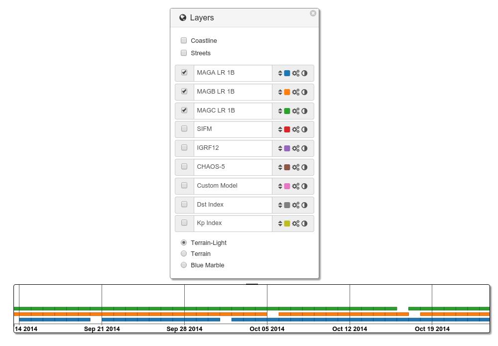
In addition to which collection is active we also need to know when data is available. Through several projects we have iterated on the timeslider (opens new window) idea to visualize this information. Layers have an assigned color and on the timeslider you can see the product availability for each active layer. The timeslider is interactive allowing zooming and panning and showing product identifiers on mouse over. There are other useful features for the timeslider which do not come into play with this type of data but I will try to describe this tool with more details in another post.
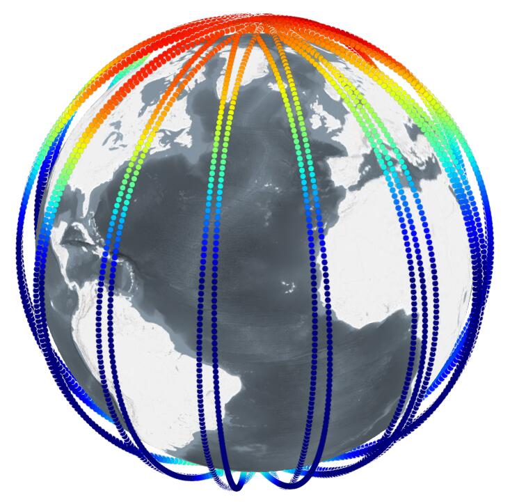
# Globe Visualization
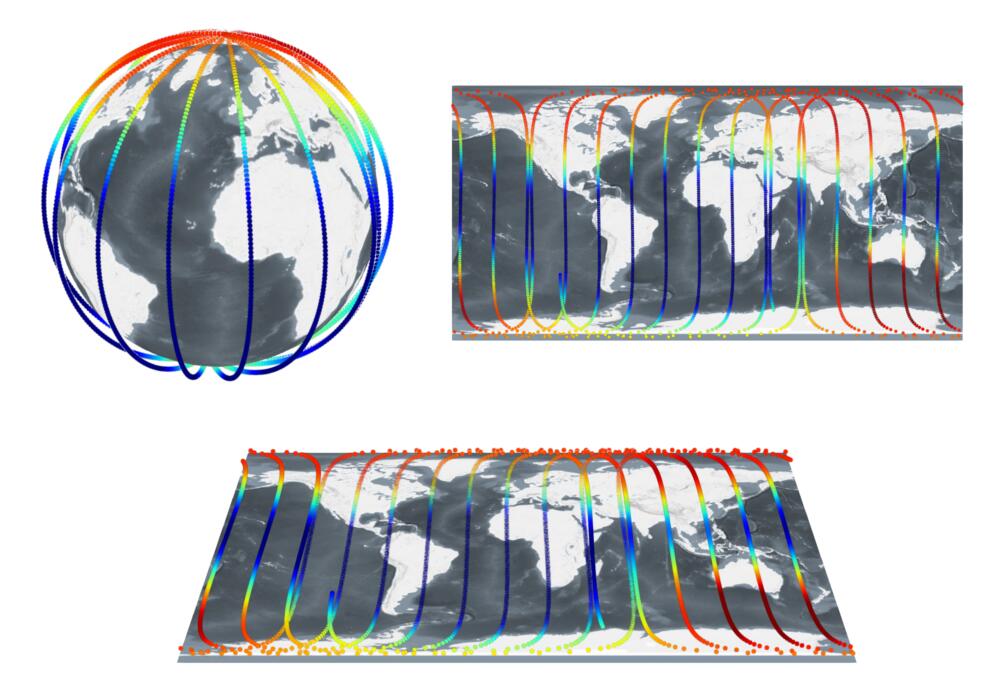
One of the two central visualizations tools is the virtual globe. It uses the awesome Cesium (opens new window) library to help create this beautiful visualizations directly on the browser using WebGL. It supports three different Views, as shown below, as 3D, 2.5D (called Columbus view), and 2D.
The image above shows the Magnetic field intensity as measured by instrumentation onboard one of the Swarm satellites at around 450 km altitude in the three possible views.
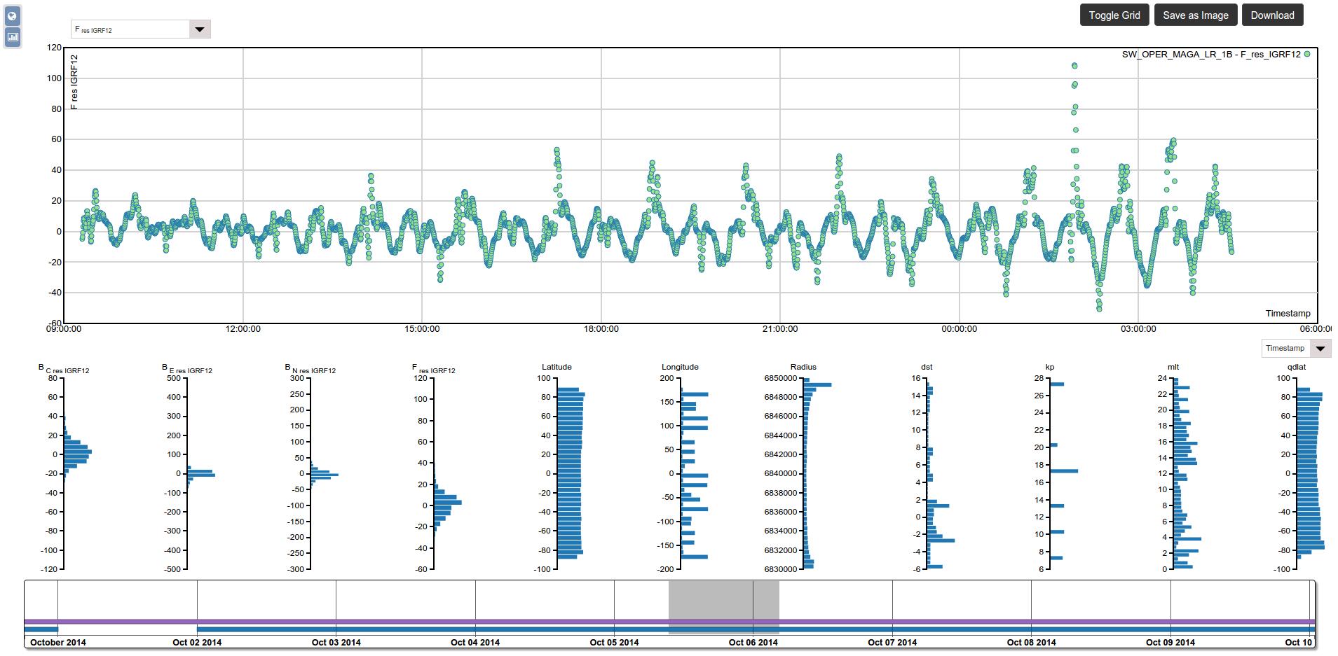
# Analytics Viewer
The second central visualization tool is what we call the Analytics Viewer. It provides a scatter plot tool for selected data at the top and histogram visualizations of available data parameters at the bottom. The whole visualization is done in SVG making use of another amazing library D3.js (opens new window) as backbone. The possibility of saving the created plots as images was required by users so we worked on a method to render the SVG into a canvas element to provide it also as image.
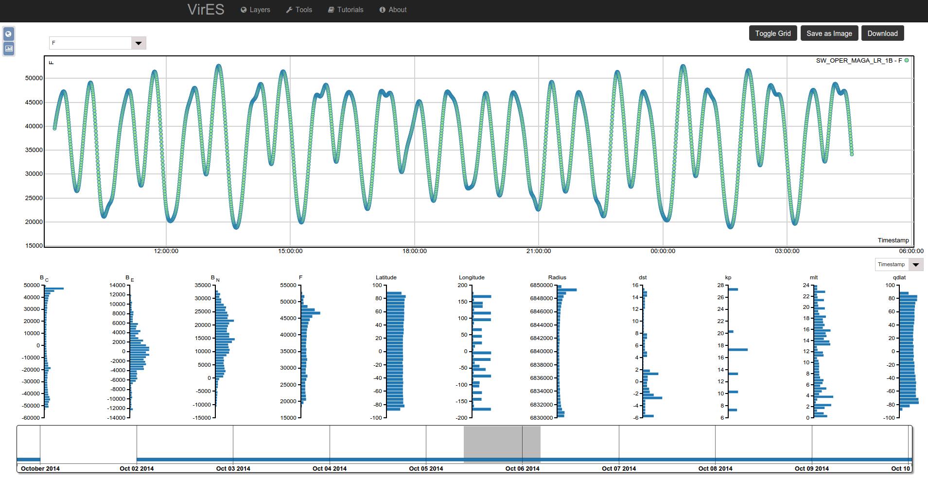
As can be seen the Swarm Data (MAG L1b) contains multiple parameters. The scatter plot tools allow multi-parameter selection in the y-axis and to be plotted against any other parameter on the x-axis through the use of both of the drop down selection elements.
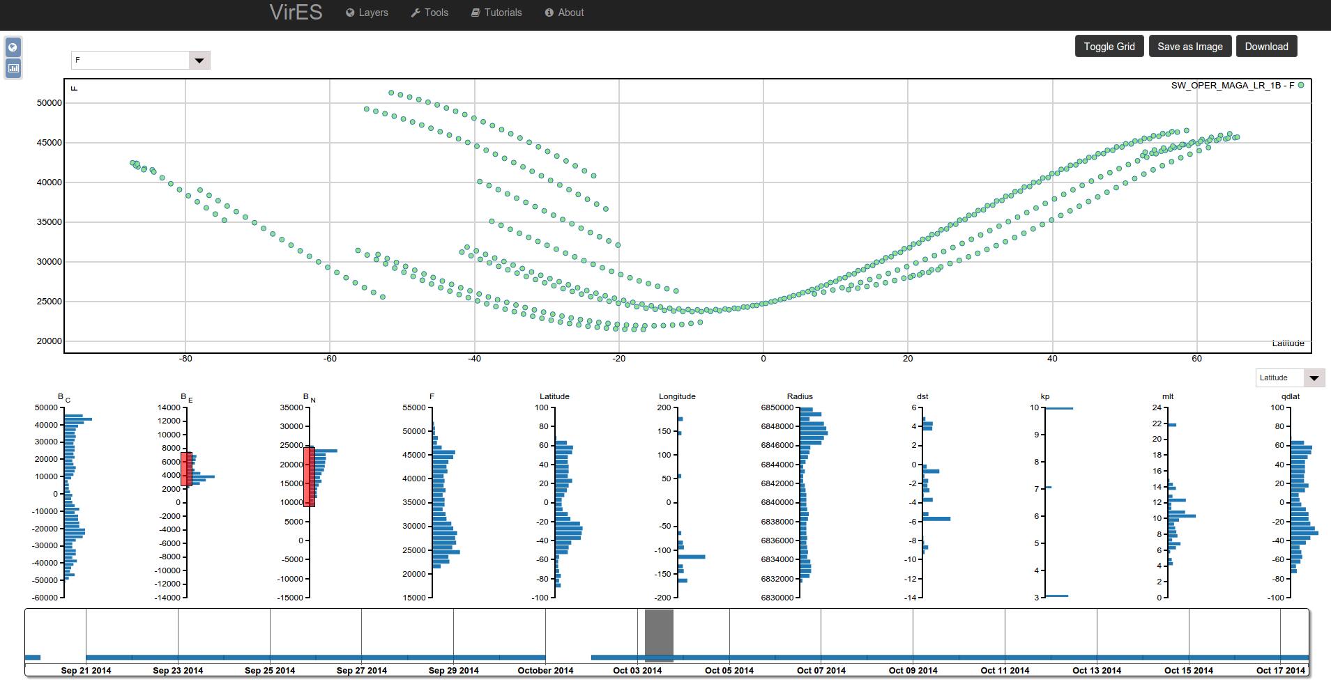
The Histogram visualization at the bottom allows multi-parameter filtering of the data by just dragging at the parameter range scales. This updates all histograms letting you know at which values the subsetted data is available.
# Data
Explaining the meaning of the next visualizations without assuming knowledge of the data is a bit difficult so let me say some words about the data.
# Swarm L1B
Firstly we have the Swarm L1B data, which measures, among many other things, Earth's magnetic field at the position of the satellite. This is what is represented in the previous images.
# Magnetic Model
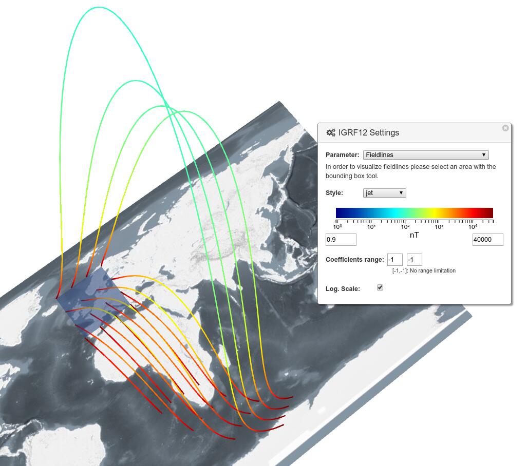
Additionally to the Swarm data we have integrated Magnetic Model Data. The model, specified as a set of coefficients, allows the computation of Earth's magnetic field for any point in space and time (where the model is applicable). A visual representation of the model at the approximate altitude of the Swarm Satellites is shown below.
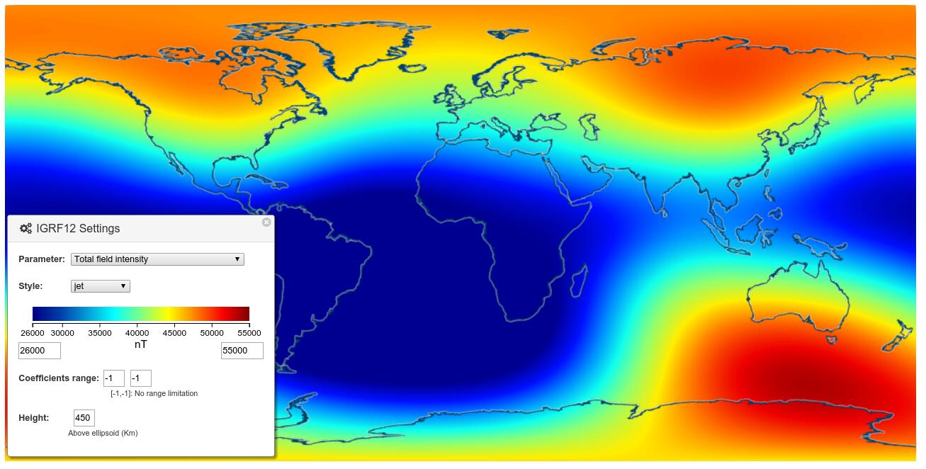
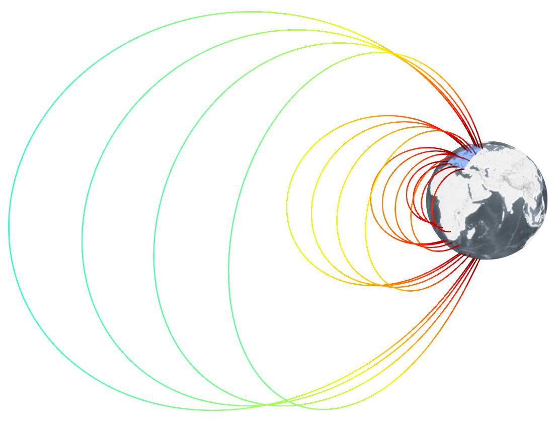
The model is actually computed in real time (pretty hefty computation) and served as WMS layer. It is even possible for a user to use their own local set of coefficients to create the visualization of the model (executed on the server). With the model calculation we can do other fancy stuff, such as calculating and displaying magnetic field lines. By selecting an area on the globe we use a 4x4 point grid as seed points, calculate the direction of the field for those points, "move" into that direction and do that until we get back to Earth, which generates fully interactive visualizations like these.
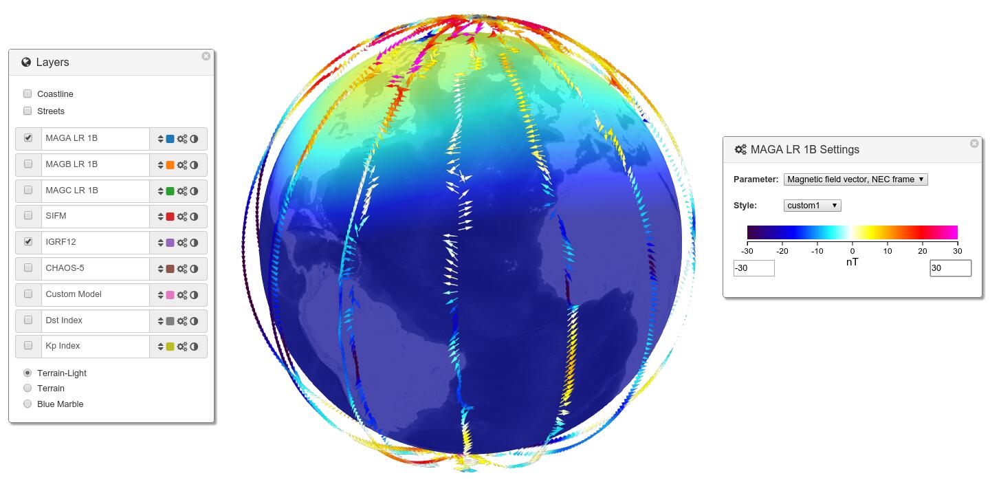
# Residuals
The requirements collection also revealed the importance of residual calculation, which is the subtraction of the model from the measurements. The residuals are important for a multitude of fields. As the calculation of the model is "expensive" we do it directly on the server per request using the WPS interface, in this way the results can be visualized directly on the web client as seen below. Note that residuals have a direction in space and are therefore drawn as vectors.
# Auxiliary
As a last point I also want to mention the introduction of auxiliary data (kp-index (opens new window) and dst-index (opens new window)) related to sun activity which has a great impact on the magnetic field. These fields are provided in the Analytics Viewer and can be used as filter criteria.
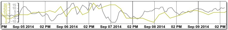
Additionally, as these indices are global, we considered the best way to display them would be on the timeslider. So we extended it to request the data directly from EOxServer and display it as line plot on the time axis. This allows very quick browsing capabilities of the data where the user can navigate and analyze a time frame where strong or weak sun activity is present.
# Final Words
I hope I could give you a clear and understandable overview of the VirES Prototype functionality. At the end it got a little out of hand as I just wanted to post some nice screenshots. Feel free to check here again for more information on the official service coming early next year as well as many other topics!